

The house’s dependable outerwear came slightly undone in a collection where flowers, embellishments, and classic British tailoring shared equal footing.

The appeal of Burberry has long been its certainty. You know the trench; you know the check; you know the particular polished version of British practicality the house has spent more than a century refining. This season, Daniel Lee’s Spring/Summer 2027 collection introduced a bit of disorder through rumpled surfaces, softened denim, playful prints, oversized floral details, and clothes that seemed designed to look better after they had actually been worn.
The effect was an intentional loosening of Burberry’s identity. The biggest shift came through Celia Birtwell, whose lively florals and illustrated smiley faces were worked into the collection. Rather than treating the check as an untouchable logo, Lee allowed it to become a background for Birtwell’s patterns, making the house’s most recognizable visual code feel like both branding and fabric. That shift gave the collection a welcome sense of ease. Lee has spent recent seasons building a Burberry universe from familiar British references: weather, work, countryside mud, nightlife, rain-soaked streets, and the practical clothes that accompany all of it.

This collection visits the opposite end of the sensible spectrum. What happens when a uniform gets a little messy? The result was perfectly charming.
The setting made that point before the first look emerged. Guests sat on wooden benches within a bright, pared-back space with models entering through a checked door that nodded to Burberry’s most recognizable motif. With little visual noise surrounding, the clothes registered as personal objects rather than polished symbols of a luxury brand.
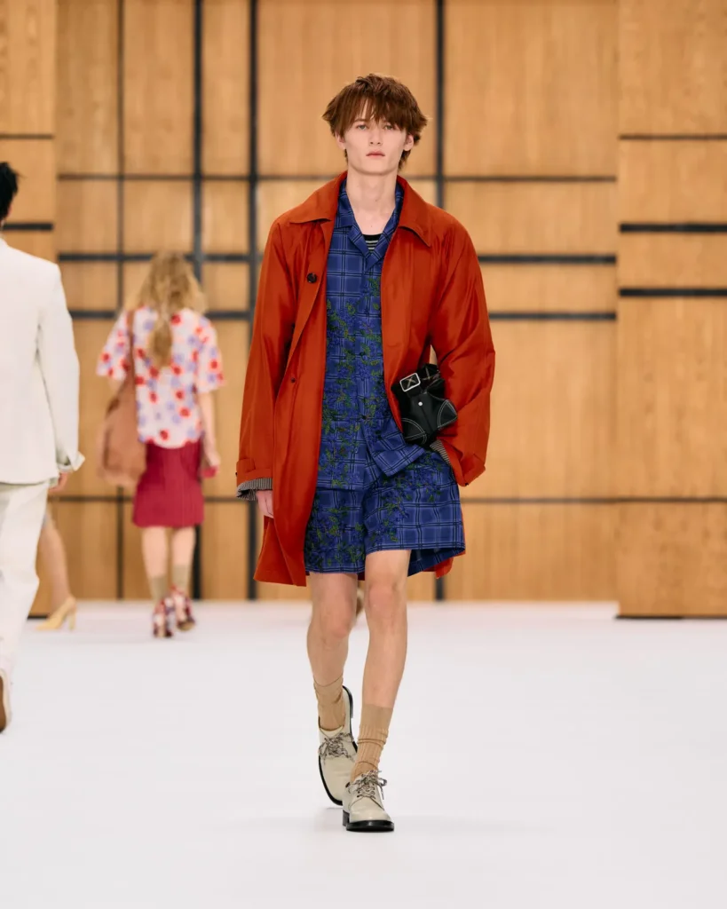
The beloved trench was still everywhere. This time, though, it flared, crumpled, shortened, shimmered, appeared in unexpected colors, and picked up embellishment. It remained an outerwear staple, but Lee also treated it as a surface for play. The relaxed physicality made the garments look as though they were meant to move through a real city rather than remain perfectly arranged on a showroom rail.
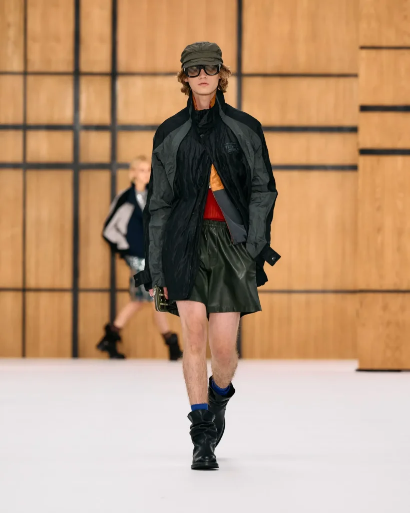
Then came the flowers. Birtwell’s prints brought visual optimism which pushed against Burberry’s traditional palette. Multi-dimensional florals were featured alongside checks and stripes, while illustrated faces added an almost handmade quality. There was a deliberate tension between the precision of a luxury house and the slightly wonky, expressive quality of drawing by hand. That tension was the collection’s most interesting idea. Even the shoes seemed to participate. Strapped clogs, technical footwear, and climbing-inspired styles appeared alongside softer looks, refusing to let the florals become overly romantic. The collection repeatedly interrupted its prettiness with something more practical, chunky, or distinctly London.
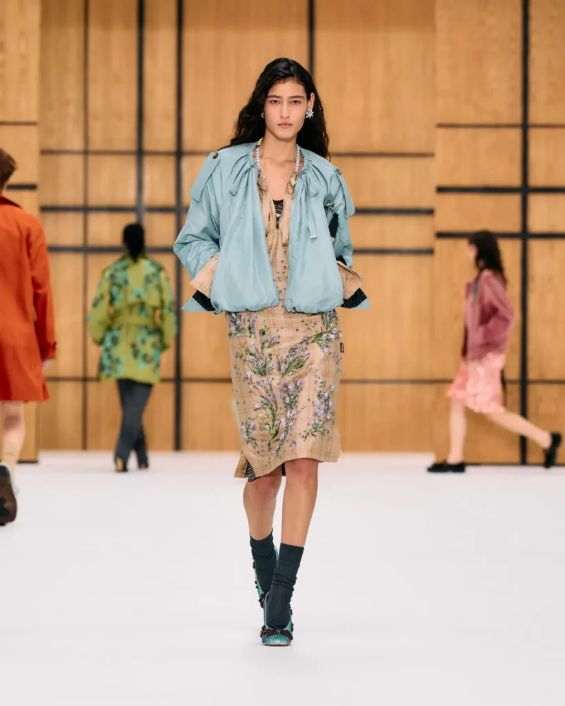
This also made the collection feel youthful. Thankfully, youthfulness here doesn’t require extreme proportions, with everything rendered tiny or oversized or filtered through a streetwear aesthetic. Instead, the energy came from letting elements clash: a polished trench beside a playful print, or a delicate floral next to a heavy shoe.
One possible challenge for a house as honored and revered as Burberry is making heritage feel current while maintaining taste. But Burberry is durable enough to be handled. This season, the answer seemed to be imperfection. Lee allowed the trench to become decorative, the check to become uneven, and the house’s utility language to make room for charm.
Navigator Media